Do you want to design a mobile app?
Do you want to design a mobile app?
Then follow this UI/ UX Design guidelines
To design a mobile app you should consider the following steps.
1. Research
%3CmxGraphModel%3E%3Croot%3E%3CmxCell%20id%3D%220%22%2F%3E%3CmxCell%20id%3D%221%22%20parent%3D%220%22%2F%3E%3CmxCell%20id%3D%222%22%20value%3D%22%22%20style%3D%22rounded%3D0%3BwhiteSpace%3Dwrap%3Bhtml%3D1%3BgradientColor%3D%23d5739d%3BfillColor%3D%23e6d0de%3BstrokeColor%3D%23996185%3B%22%20vertex%3D%221%22%20parent%3D%221%22%3E%3CmxGeometry%20x%3D%2240%22%20y%3D%22160%22%20width%3D%2280%22%20height%3D%2280%22%20as%3D%22geometry%22%2F%3E%3C%2FmxCell%3E%3CmxCell%20id%3D%223%22%20value%3D%22%26lt%3Bb%26gt%3BResearch%26lt%3B%2Fb%26gt%3B%22%20style%3D%22text%3Bhtml%3D1%3BstrokeColor%3Dnone%3BfillColor%3Dnone%3Balign%3Dcenter%3BverticalAlign%3Dmiddle%3BwhiteSpace%3Dwrap%3Brounded%3D0%3B%22%20vertex%3D%221%22%20parent%3D%221%22%3E%3CmxGeometry%20x%3D%2260%22%20y%3D%22190%22%20width%3D%2240%22%20height%3D%2220%22%20as%3D%22geometry%22%2F%3E%3C%2FmxCell%3E%3CmxCell%20id%3D%224%22%20value%3D%22%22%20style%3D%22whiteSpace%3Dwrap%3Bhtml%3D1%3Baspect%3Dfixed%3BgradientColor%3D%23d5739d%3BfillColor%3D%23e6d0de%3BstrokeColor%3D%23996185%3B%22%20vertex%3D%221%22%20parent%3D%221%22%3E%3CmxGeometry%20x%3D%22160%22%20y%3D%22160%22%20width%3D%2280%22%20height%3D%2280%22%20as%3D%22geometry%22%2F%3E%3C%2FmxCell%3E%3CmxCell%20id%3D%225%22%20value%3D%22%26lt%3Bb%26gt%3BConcept%26lt%3B%2Fb%26gt%3B%22%20style%3D%22text%3Bhtml%3D1%3BstrokeColor%3Dnone%3BfillColor%3Dnone%3Balign%3Dcenter%3BverticalAlign%3Dmiddle%3BwhiteSpace%3Dwrap%3Brounded%3D0%3B%22%20vertex%3D%221%22%20parent%3D%221%22%3E%3CmxGeometry%20x%3D%22180%22%20y%3D%22190%22%20width%3D%2240%22%20height%3D%2220%22%20as%3D%22geometry%22%2F%3E%3C%2FmxCell%3E%3CmxCell%20id%3D%226%22%20value%3D%22%22%20style%3D%22whiteSpace%3Dwrap%3Bhtml%3D1%3Baspect%3Dfixed%3BgradientColor%3D%23d5739d%3BfillColor%3D%23e6d0de%3BstrokeColor%3D%23996185%3B%22%20vertex%3D%221%22%20parent%3D%221%22%3E%3CmxGeometry%20x%3D%22280%22%20y%3D%22160%22%20width%3D%2280%22%20height%3D%2280%22%20as%3D%22geometry%22%2F%3E%3C%2FmxCell%3E%3CmxCell%20id%3D%227%22%20value%3D%22%22%20style%3D%22whiteSpace%3Dwrap%3Bhtml%3D1%3Baspect%3Dfixed%3BgradientColor%3D%23d5739d%3BfillColor%3D%23e6d0de%3BstrokeColor%3D%23996185%3B%22%20vertex%3D%221%22%20parent%3D%221%22%3E%3CmxGeometry%20x%3D%22400%22%20y%3D%22160%22%20width%3D%2280%22%20height%3D%2280%22%20as%3D%22geometry%22%2F%3E%3C%2FmxCell%3E%3CmxCell%20id%3D%228%22%20value%3D%22%26lt%3Bb%26gt%3BDesign%26lt%3B%2Fb%26gt%3B%22%20style%3D%22text%3Bhtml%3D1%3BstrokeColor%3Dnone%3BfillColor%3Dnone%3Balign%3Dcenter%3BverticalAlign%3Dmiddle%3BwhiteSpace%3Dwrap%3Brounded%3D0%3B%22%20vertex%3D%221%22%20parent%3D%221%22%3E%3CmxGeometry%20x%3D%22300%22%20y%3D%22190%22%20width%3D%2240%22%20height%3D%2220%22%20as%3D%22geometry%22%2F%3E%3C%2FmxCell%3E%3CmxCell%20id%3D%229%22%20value%3D%22%26lt%3Bb%26gt%3BTest%26lt%3B%2Fb%26gt%3B%22%20style%3D%22text%3Bhtml%3D1%3BstrokeColor%3Dnone%3BfillColor%3Dnone%3Balign%3Dcenter%3BverticalAlign%3Dmiddle%3BwhiteSpace%3Dwrap%3Brounded%3D0%3B%22%20vertex%3D%221%22%20parent%3D%221%22%3E%3CmxGeometry%20x%3D%22420%22%20y%3D%22190%22%20width%3D%2240%22%20height%3D%2220%22%20as%3D%22geometry%22%2F%3E%3C%2FmxCell%3E%3CmxCell%20id%3D%2210%22%20value%3D%22%22%20style%3D%22endArrow%3Dclassic%3Bhtml%3D1%3BexitX%3D1%3BexitY%3D0.5%3BexitDx%3D0%3BexitDy%3D0%3B%22%20edge%3D%221%22%20source%3D%222%22%20parent%3D%221%22%3E%3CmxGeometry%20width%3D%2250%22%20height%3D%2250%22%20relative%3D%221%22%20as%3D%22geometry%22%3E%3CmxPoint%20x%3D%22320%22%20y%3D%22280%22%20as%3D%22sourcePoint%22%2F%3E%3CmxPoint%20x%3D%22160%22%20y%3D%22200%22%20as%3D%22targetPoint%22%2F%3E%3CArray%20as%3D%22points%22%2F%3E%3C%2FmxGeometry%3E%3C%2FmxCell%3E%3CmxCell%20id%3D%2211%22%20value%3D%22%22%20style%3D%22endArrow%3Dclassic%3Bhtml%3D1%3BentryX%3D0%3BentryY%3D0.5%3BentryDx%3D0%3BentryDy%3D0%3B%22%20edge%3D%221%22%20target%3D%226%22%20parent%3D%221%22%3E%3CmxGeometry%20width%3D%2250%22%20height%3D%2250%22%20relative%3D%221%22%20as%3D%22geometry%22%3E%3CmxPoint%20x%3D%22240%22%20y%3D%22200%22%20as%3D%22sourcePoint%22%2F%3E%3CmxPoint%20x%3D%22170%22%20y%3D%22210%22%20as%3D%22targetPoint%22%2F%3E%3CArray%20as%3D%22points%22%2F%3E%3C%2FmxGeometry%3E%3C%2FmxCell%3E%3CmxCell%20id%3D%2212%22%20value%3D%22%22%20style%3D%22endArrow%3Dclassic%3Bhtml%3D1%3BentryX%3D0%3BentryY%3D0.5%3BentryDx%3D0%3BentryDy%3D0%3B%22%20edge%3D%221%22%20target%3D%227%22%20parent%3D%221%22%3E%3CmxGeometry%20width%3D%2250%22%20height%3D%2250%22%20relative%3D%221%22%20as%3D%22geometry%22%3E%3CmxPoint%20x%3D%22360%22%20y%3D%22200%22%20as%3D%22sourcePoint%22%2F%3E%3CmxPoint%20x%3D%22290%22%20y%3D%22210%22%20as%3D%22targetPoint%22%2F%3E%3CArray%20as%3D%22points%22%2F%3E%3C%2FmxGeometry%3E%3C%2FmxCell%3E%3C%2Froot%3E%3C%2FmxGraphModel%3E
- A persona is a representation of type of user.
- Survey is a great way of asking user direct questions.
- Interviews with colleges is a great way to understand business requirements.
2. Concept
- Its important to understand the whole machine before designing an individual piece.
- The customer journey map shows your whole process from beginning to end.
- A tree test is an examination of your information architect.
- A cart sort will help you define your information architecture.
3. Design
- workshops are grate way to share the ideas with the teams involved
- before you design , set the scene by discussing your research findings.
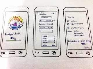
- It is better to get the ideas in to paper
- working with papers and pens allows us to become less attached to our design.
- wire frames are final out put.
Paper prototype
Wire frame design - Birthday reminder app using - Draw.io
4. Testing
- User testing is to get the product in front of users as early as possible.
- online user testing deliver large amount of data i.
- User testing can give you actual feedback.
UI/UX Design guidelines for a mobile application development.
1. Minimize cognitive load
- Reduce brain power for the functions
- minimize distractions from images animations sound etc.
- Self guide for each function.
- simple workflow
- icons and controls are visible clearly
2. Cutting out the clutter
- minimize complication of the screen by reducing unnecessary icons, images, buttons.
- reduce the content only by keeping what users look for
- overload users with too much information.
4. Break tasks into smaller as possible
- Identify and arrange sub tasks and super tasks in correct order
5. User familiar screens
- use more common screens.
- search famous apps and use similar features
- Use screens that users sees in many apps
6. Help to user input
- Use auto complete features
- Remove unnecessary fields.
- Dynamically validate field values
- helps with tips when ever user required.
7. Be aware of color blindness
8. make the design consistent
- To eliminate confusion
- Buttons labels are consistent across the app.
- Interactive elements should work similarly in all parts of your app.
- design should be consistent across multiple products.
9. Design finger friendly tap targets
10. Meaning full error messages
11. Offload tasks
- Entering data and making a decision
- Reuse existing user data and auto fill information of the user
- Suggest data insertion
- Guide with sample input data
- meaning full and short messages
- Entering data and making a decision
- Reuse existing user data and auto fill information of the user
- Suggest data insertion
- Guide with sample input data
- meaning full and short messages


Nice work.keep it up.
ReplyDelete